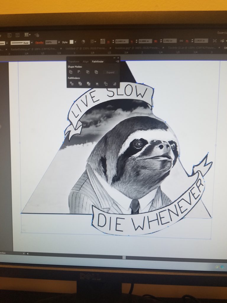
This week’s task: create a ~perfect~ version of one of the laser cut models in the prototyping library. Being the overflowing pot of ambition that I am, I decided to tackle one of the tougher models (for me at least): creating an image using the raster setting on the laser cutter. I have never done this before. There’s a significant amount of trial and error, and it’s much more art than science. Nevertheless, I think I came out with a really fun and well-done model by the end.
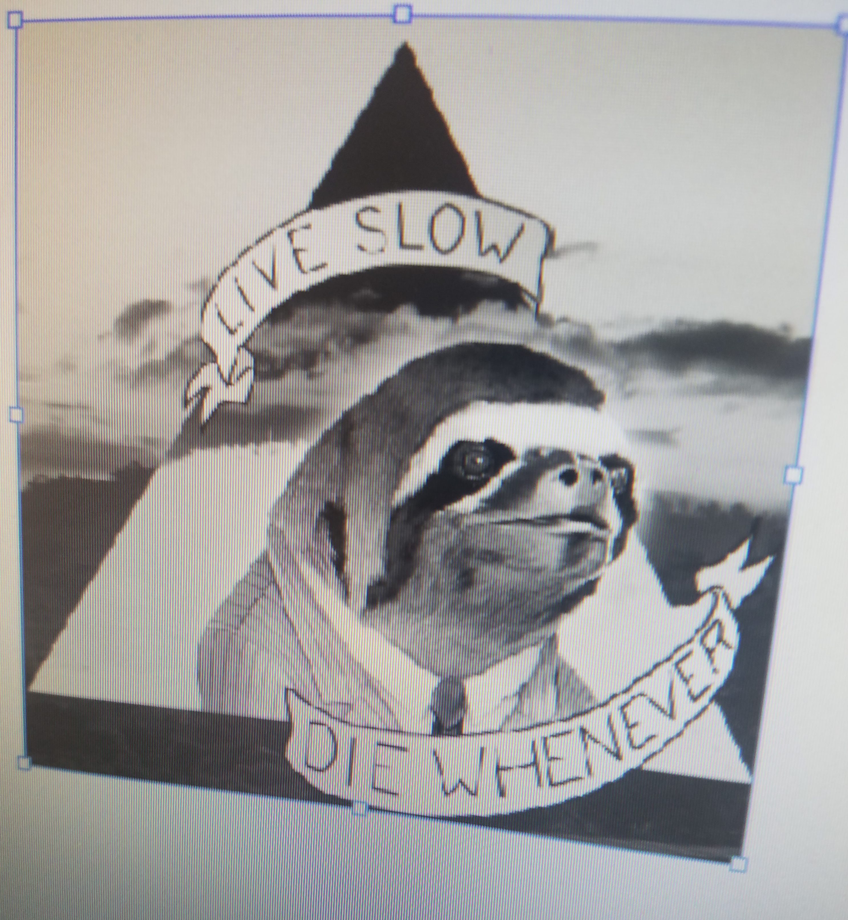
My choice of image: this amazing desktop wallpaper of a sloth that is truly inspirational. I chose this image because there was a large array of shades to work with, and I wanted to try the mix of text and image.

Words to live by
I turned my image grayscale first. It turned out surprisingly well. I then attempted to crop it, which is somehow incredibly difficult. Illustrator doesn’t have a native crop function, so I had to create a rectangle of the proper size, then use it as a clipping mask to resize the image. This seems convoluted, but it comes in handy later, so stay tuned.
Grayscale is the new black
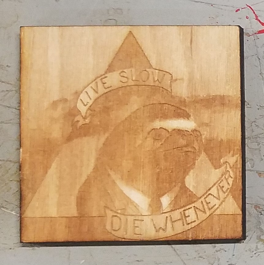
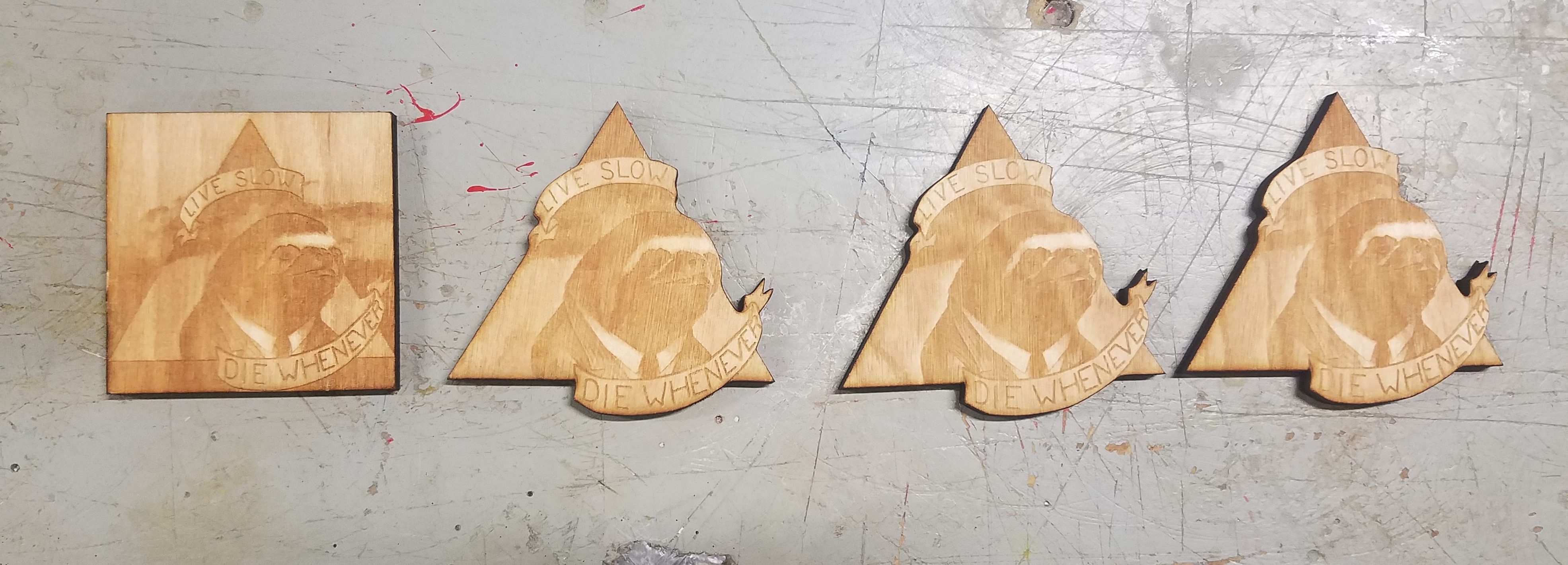
Iteration 1: Power 40 Speed 40
I jumped straight into the raster and began an etch of this first model. I started with 40 speed 40 power just because it felt right. The piece came out legible and pretty cool, but I identified a few issues. First, the image seemed a bit too dark. The different shapes got a little bit muddled in the dark areas. Secondly, I could not deal with the fact that the image was a triangle, but the cut out was a square.
To fix this grave issue, I returned to my old friend, the clipping mask. I started by using the pen tool in Illustrator to trace the outside of the triangle shape, with extra juts for the ribbons. This tool took some adjustment, but I got a good outline in the end. I then followed the same procedure as before to crop the image in this custom shape. As a bonus, this path is the perfect shape for the laser cutter to perform the final vector cut.
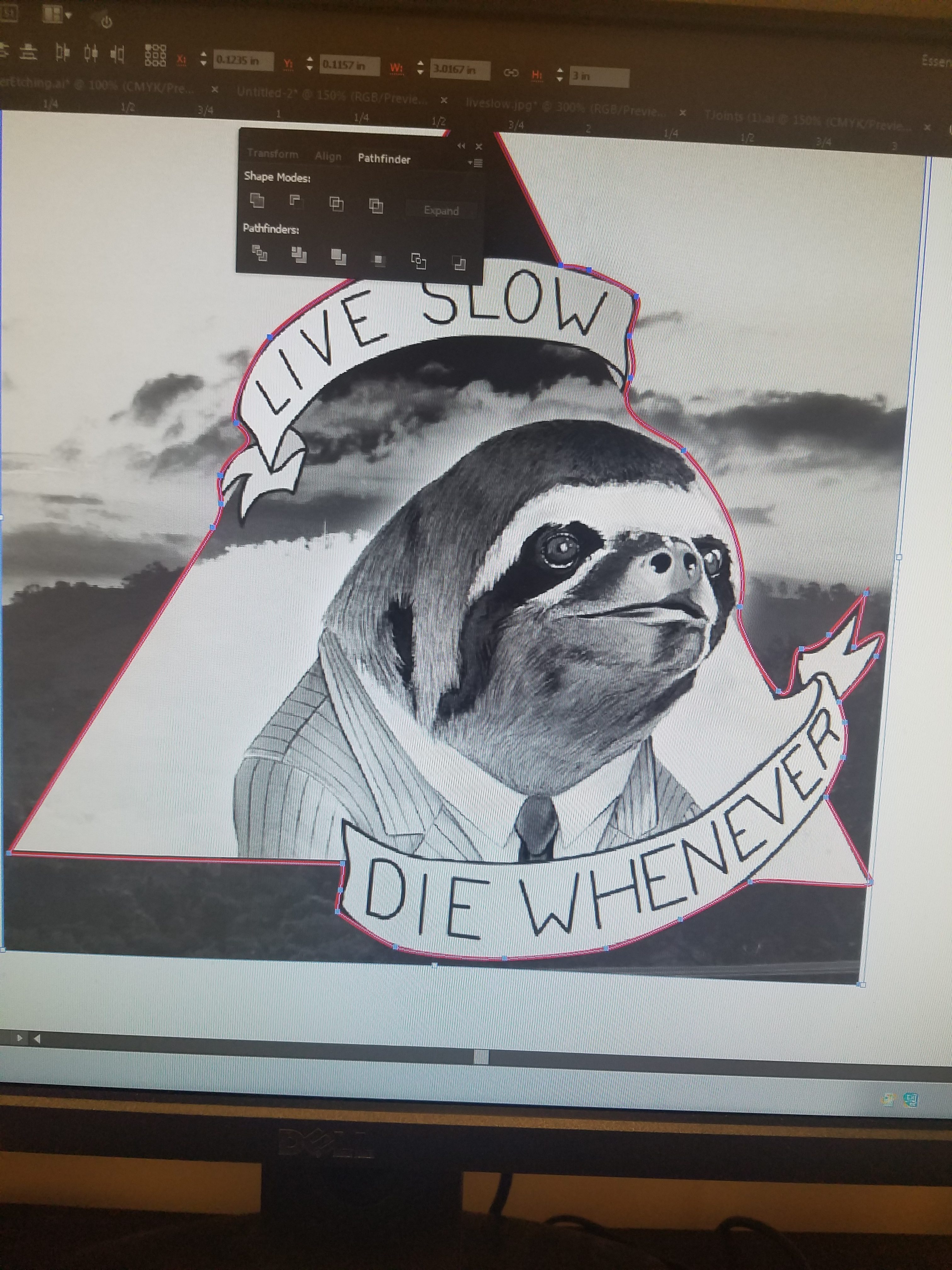 Red line is drawn pen path |
 Path becomes clipping mask to cut image and give path for vector cut |
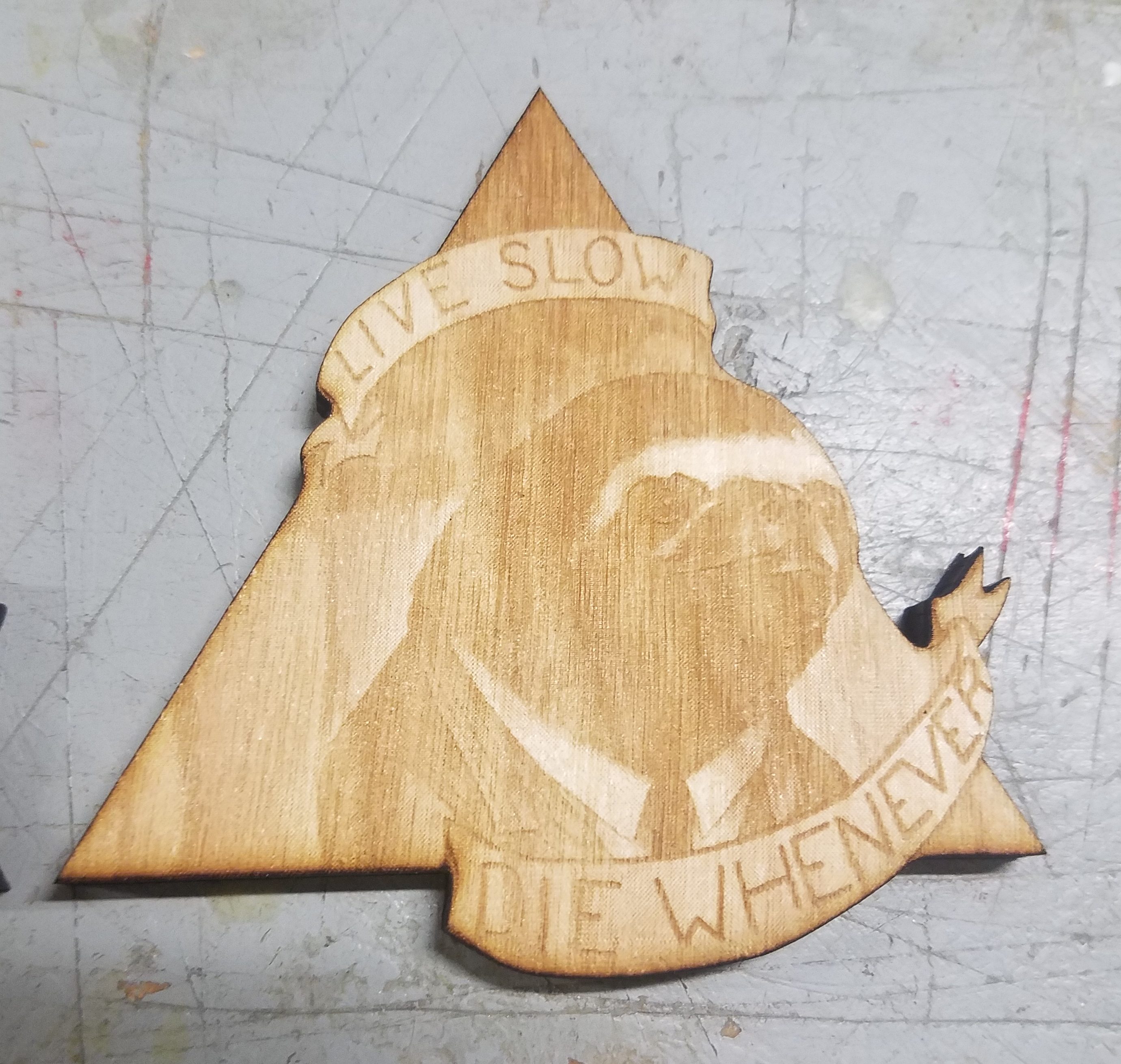
Iteration 2: Power 30 Speed 20
I used this new vector/raster file to etch a new image on my wood piece. To make the piece less dark, I used different power settings: Speed 20, Power 30. This image came out a little too light for me, and the contrast seemed very low. I’ll need to up the power for the next round.
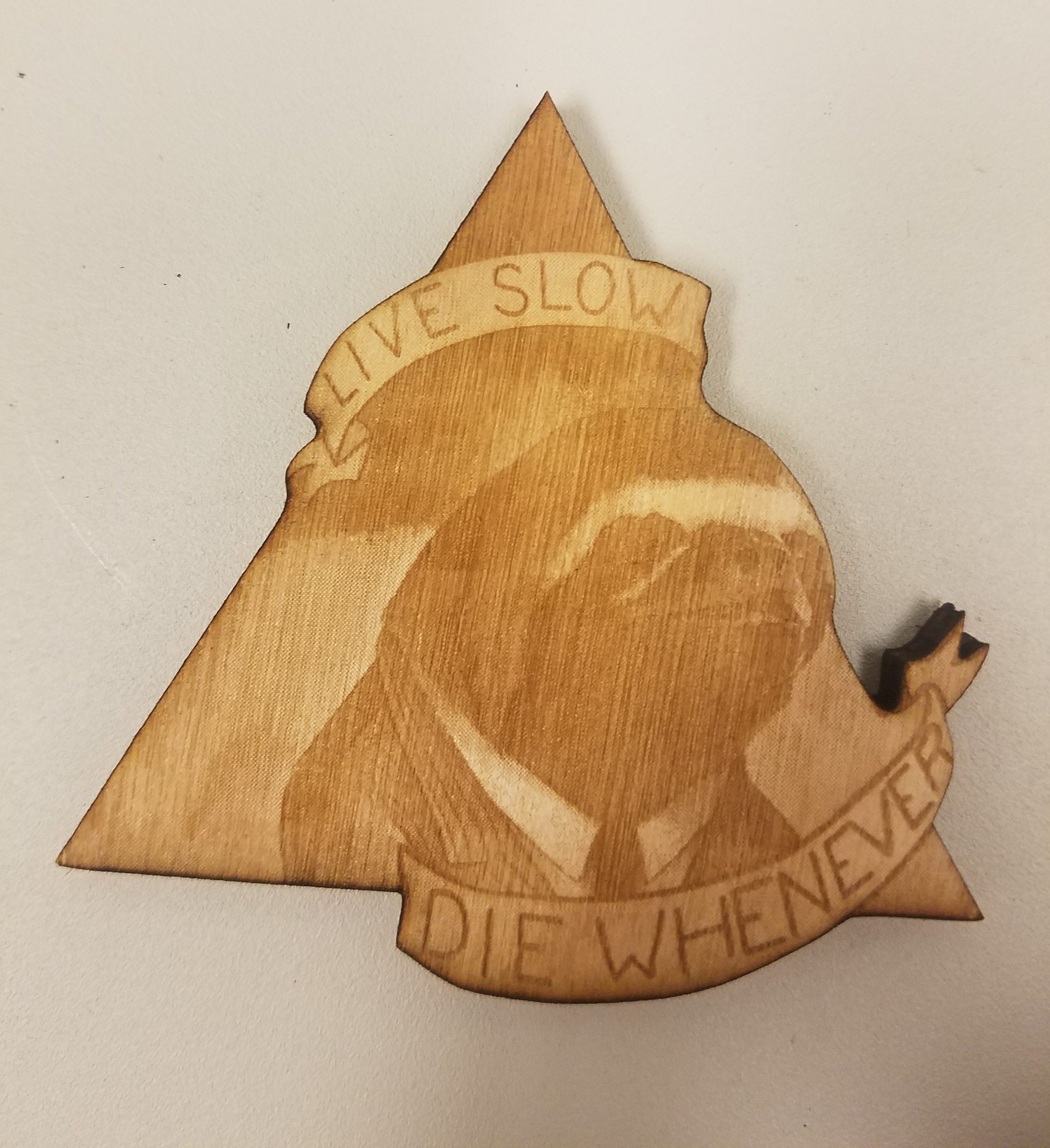
Iteration 3: Power 40 Speed 25
Third time’s the charm. For this iteration, I pumped up the power from 30 to 40, to increase contrast and darkness. I also upped the speed from 20 to 25 to balance out this power increase. This iteration was my favorite for sure. There was great contrast and the letters were super legible. After seeing how well this turned out, I knew this would be my perfect version. I etched and cut and identical copy using the same method.
After cutting both images, I flipped over the wood pieces and etched the settings on the back for posterity. Below is my progression of raster etches, from dark to light to just right.