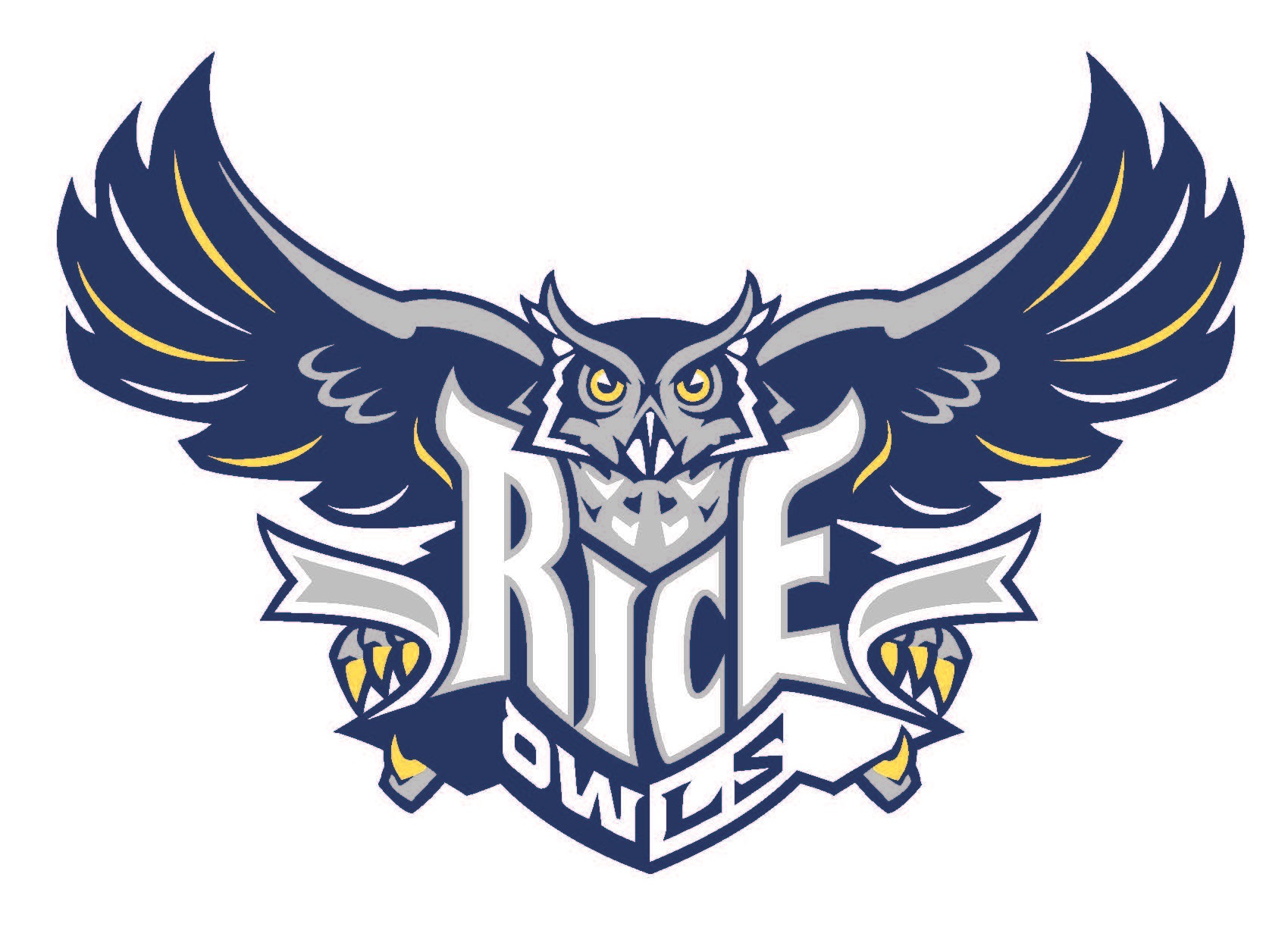
Figure 1: Colored war owl
Laser cutting the war owl from 1/4″ plywood proved to be a challenging task that took many iterations to determine the right settings for etching. The vector image of the war owl was provided in an Adobe Illustrator .ai file and was divided into four layers — one each for the grey, yellow, blue, and white portions of the war owl design (Figure 1). We set out to recreate this image by preserving the color contrast between the four layers as we etched the design into wood. We chose to iterate our laser cutter settings by etching each layer sequentially (e.g. blue, grey, yellow, cut out, repeat with new owl). I’ll describe our major iterations and the changes we made to reach our final settings.

Figure 2: Ugly, burned war owl
Iteration #1: An Ugly, Burned Owl
We began by etching the blue layer because we knew that it should be the darkest. For a first attempt, we decided to use the 1/4″ combined preset on the Epilog laser cutter (S: 40%, P: 100%, 400dpi). We found that this produced a background that was just slightly burned but about the right darkness. We did the grey layer next, as it is the second darkest layer. Our initial attempt (speed: 20%, power: 60%, 400dpi) provided results that were far too dark. Portions of the owl’s face were burned and very ugly. Our first attempt at the yellow layer (S: 25%, P: 30%, 4oodpi) was a little too dark as well, since it didn’t stand out at all from then blue areas of the owl. Since the white layer was intended to be the lightest, we opted not to etch it at all, but rather to let this layer “pop” out as areas of natural wood. We did not etch the white layer on any of our iterations. To cut the owl, we used the solid blue layer, then cut the outline using the 1/4″ vector preset for wood (S: 10%, P: 100%, 600dpi). We did this for all attempts.

Figure 3: Less-burned war owl
Iteration #2: Fixing the Burned Layers
For this owl, we focused on fixing the grey and yellow layers, so we left the blue layer at the 1/4″ combined preset (S: 40%, P: 100%, 400dpi). This time we increased the speed and significantly reduced the power of the etch (S: 25%, P: 20%, 400dpi) in order to prevent the burning that we saw on the first owl. This resulted in a very light etch, so we ran the etch twice to make it a bit more noticeable. We ran the yellow layer etch with the same settings (S: 25%, P: 20%, 400dpi), intending to only run it once. However, there was no apparent contrast between the yellow and white layers after doing this. We chose to run it once more, making it identical to the grey layer. This owl was much better than the previous one, despite a little bit of burning on the blue layer and a lack of contrast between the grey and yellow layers.
Iteration #3: Improving Contrast
To reduce the charred look of the blue layer, we slightly increased the speed and held the other parameters constant (S: 50%, P: 100%, 400dpi). This resulted in a dark background layer that was clean and not burned. For the grey layer, we chose to increase both speed and power to get a darker etch (S: 50%, P: 50%, 400dpi). This gave a good level of darkness, but we noticed that the shading appeared very pixelated from the rectangular (normal) laser point distribution. For the yellow layer we aimed for a slightly lighter shade than the grey layer, so we increased the speed slightly (S: 65%, P: 50%, 400dpi). This setting proved to be a little too light for etching the yellow layer. These settings were our best yet, but we wanted to improve upon the pixelated look of the grey layer (similar to Figure 2) and the contrast between the yellow and white layers.

Figure 4: War owl with Jarvis raster setting
Iteration #4: Jarvis Rastering
The primary change in this iteration was to explore some of the advanced raster settings, including the laser-point distribution setting. We thought that this might reduce the pixelated look of our previous attempts. We changed from standard to “Jarvis”, which made the etching appear more like smooth lines rather than individual laser dots. However, this significantly decreased the apparent darkness of the blue layer, so we abandoned this setting and kept our previous etch configuration. For the grey layer, Jarvis produced very clean looking results. For the yellow layer, we both implemented Jarvis and reduced the speed slightly (S: 60%, P: 50%, 400dpi) to increase the contrast with the white layer. Overall this owl was the cleanest, but the blue layer was too light so the owl ultimately looked worse than the last.
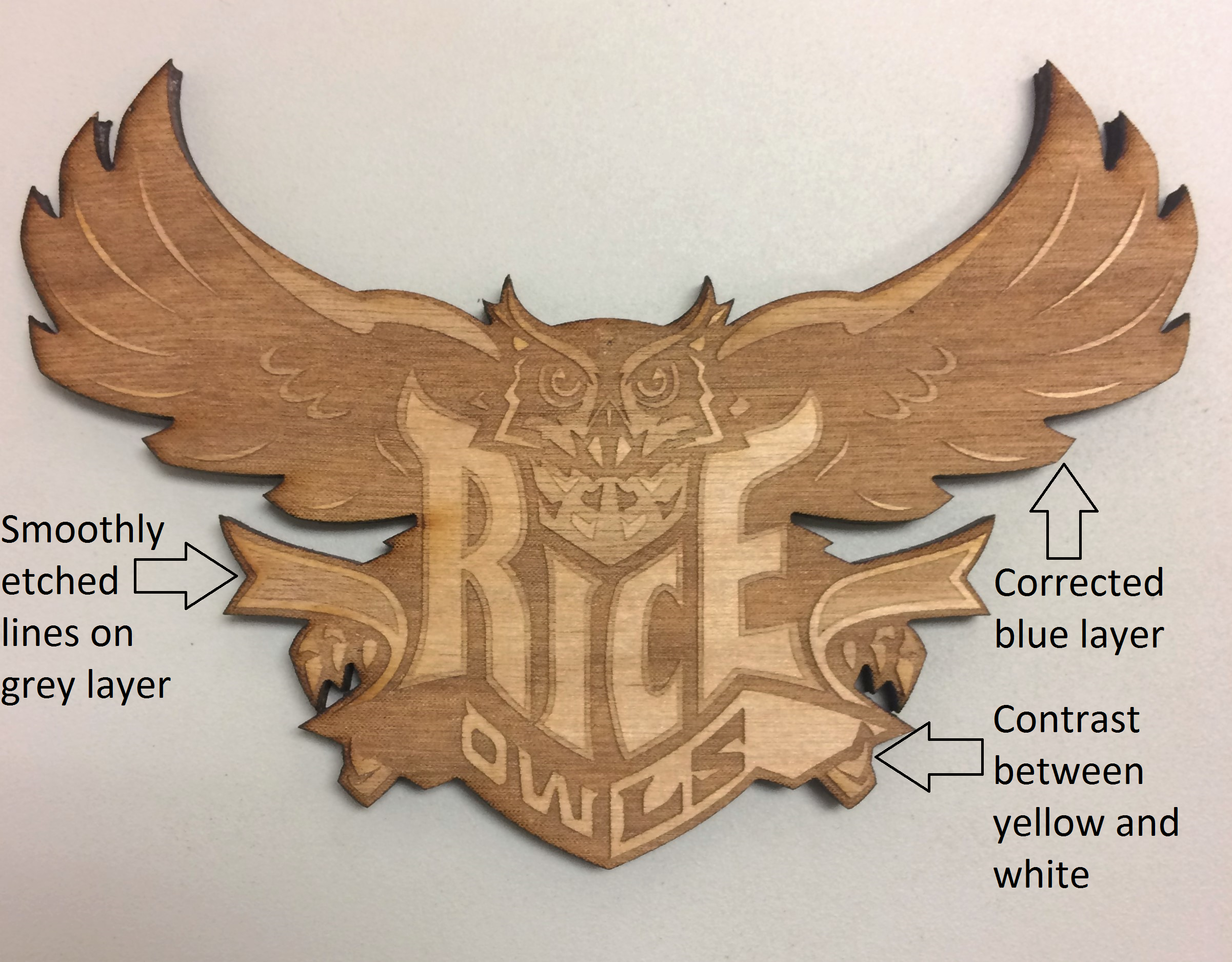
Figure 5: Final war owl
Iteration #5: Final War Owl
For our final war owl, we kept the settings the same as in iteration 4 but removed the Jarvis setting on the blue layer. This provided the right amount of contrast in the blue layer, gave the grey sections a smoother, less pixelated look, and allowed the yellow to stand out slightly from the white. This war owl was our best. If we had more time, we would have changed grey and yellow etch settings to get greater contrast across the grey, yellow and white layers. In addition, we would have tried something else for cutting out the owl, since the Epilog preset for 1/4″ wood (S: 10%, P: 100%, 600dpi) caused some burning on the owl (especially on the “R” of “Rice”). Overall, we were happy with this final attempt.

Blue layer: P100%, S50%, 400dpi, raster (normal)
Grey layer: P50%, S50%, 400dpi, raster (Jarvis)
Yellow layer: P50%, S60%, 400dpi, raster (Jarvis)
White layer: No etching
Cut: 1/4″ cut preset (S: 10%, P: 100%, 600dpi, vector)
